Skip generic visuals! Attract audiences to your rhythmic gatherings with visuals that echo the unique sonic character of your event. Think beyond basic layouts and predictable imagery. Consider: color palettes that evoke specific musical genres (deep blues and purples for downtempo electronic, vibrant oranges and yellows for upbeat ska), typography that mimics the structure of a musical score, and graphical elements that represent sound waves or amplifier waveforms.
Instead of relying on stock photos of performers, commission unique illustrations or abstract artwork that captures the event’s atmosphere. For events featuring multiple artists, a collage of textures and geometric shapes, each representing a different sonic element, can provide a visually captivating alternative to simple headshots. Explore printing techniques like foil stamping or letterpress to add a tactile and luxurious feel.
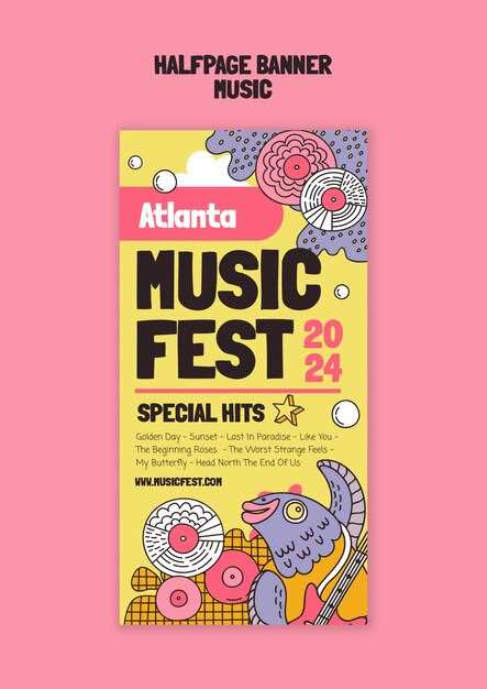
Prioritize legibility: The event name, date, and location should be immediately apparent, even at a distance. Employ a hierarchical layout, placing the most vital details in the largest font size and using contrasting colors to ensure they pop. Leverage QR codes that link directly to ticket sales pages or detailed artist bios, making it effortless for potential attendees to learn more and secure their spot. Consider the application: will it be viewed primarily on mobile phones or printed at a large format?
Crafting Visual Hooks: Color & Typography
Select a maximum of three primary colors. Using a monochromatic scheme with variations in saturation and value (e.g., dark teal, teal, light teal) creates visual harmony. For high energy event publicity, consider a complementary color scheme (e.g., blue and orange) but manage saturation to avoid harshness.
Typeface Pairing for Readability
Combine a bold sans-serif for headlines (e.g., Montserrat, Bebas Neue) with a legible serif for body text (e.g., Merriweather, Lora). Ensure sufficient contrast between the two; avoid using fonts that are too similar in weight or style.
Color Psychology Considerations
Red evokes excitement and energy, suitable for high-impact publicity. Blue conveys trust and stability, better aligned with more established or formal gatherings. Yellow symbolizes happiness and optimism, drawing attention but potentially overwhelming if overused. Green suggests growth and nature, fitting for outdoor celebrations or eco-conscious brandings.
Set a clear visual hierarchy with type size and weight. Headings should be significantly larger and bolder than subheadings, followed by body text. Use negative space effectively to prevent visual clutter and improve legibility. Consider a modular grid for layout, ensuring consistent alignment and visual balance.
Beyond the Logo: Unique Image Strategies
Instead of generic concert shots, use abstract imagery reflecting the event’s sonic character. Think distorted waveforms visualizing the event’s sound profile, or a vibrant color palette based on the performers’ sonic signatures. This visually communicates the overall vibe without relying on literal depictions.
Custom-Crafted Typography as Imagery
Transform the event’s name or slogan into a central visual element. Deconstruct the lettering, adding textural elements like gritty textures or organic shapes, making the typography a mini-artwork that captivates attention. Manipulate fonts to mirror the artistic bent, ensuring the visual reflects the aural experience.
Blending Photography and Illustration
Merge photographic elements (e.g., close-ups of instruments, audience silhouettes) with hand-drawn illustrations or vector graphics. This hybrid approach offers a fresh aesthetic, enabling you to create surreal and memorable visuals. Incorporate drawings around photographic portraits, interweaving reality with imaginative expression.
Printing Smart: Materials & Size Choices
Select 170gsm matte paper for budget-friendly handouts; upgrade to 250gsm gloss for increased durability and visual impact at eye-level. For outdoor gatherings, consider waterproof vinyl or polypropylene.
Standard Sizes & Application
A3 (297 x 420mm) suits local shops and smaller venues. A2 (420 x 594mm) balances visibility and cost-effectiveness for public spaces. A1 (594 x 841mm) maximizes impact in large areas but requires higher budgets and permission for display.
Material Finishes for Visual Impact
Matte finish reduces glare, ideal for text-heavy layouts. Gloss finish enhances color vibrancy, best for image-driven promotions. Consider a satin finish for a compromise between the two. Lamination provides added protection and enhances perceived quality, particularly for recurring programs.
Q&A
My festival targets a very niche genre of music (avant-garde jazz). How can I create a poster that appeals to that specific audience without alienating potential newcomers?
For a niche genre like avant-garde jazz, focus on visual elements that resonate with the intellectual and artistic sensibilities associated with the music. Think about abstract forms, unconventional typography, and color palettes that evoke a sense of experimentation and sophistication. You could incorporate imagery inspired by the history of the genre but presented in a modern way. Also, carefully chosen wording that hints at the experimental nature of the music will invite curious minds.
Are there inexpensive methods for printing posters to keep costs down, without sacrificing a decent look?
Yes, certainly! Explore options such as bulk printing with online services known for competitive prices. Consider using a simpler design with fewer colors, as each color adds to the printing cost. Utilize cost-effective paper stocks; a matte finish can still look professional. Also, if possible, print in standard sizes to avoid custom cuts, which increase expenditure.
How do I ensure my poster design is accessible to individuals with visual impairments?
Accessibility is a significant factor! Employ high contrast between text and background colors. Choose a typeface that is easy to read. Avoid overly decorative fonts. Consider adding a QR code that links to a webpage with detailed information about the festival. The website can have accessible formatting and descriptions of the music and artists. Furthermore, ensure sufficient spacing between elements to prevent visual clutter.
I’m organizing a local music festival with a limited budget. What are some easy-to-use tools I can use to design a poster myself, without needing a graphic design degree?
Fortunately, numerous user-friendly tools exist! Canva offers pre-designed templates and drag-and-drop functionality, making it simple to create eye-catching posters. Adobe Express is another option with a library of assets and customizable templates. If you’re seeking a free alternative, consider using GIMP (a photo editor) with its extensive features, or Inkscape (for vector graphics creation). Check online for tutorials and resources to help you learn these programs. Consider utilizing free stock photos.
What crucial information must be included on a music festival poster besides the headlining bands?
Beyond the headliners, it’s important to include the date(s) and time(s) of the festival. State the location precisely (address or venue name). Mention ticket information (where to purchase, price range). Incorporate the festival’s website or social media handles for information. Indicate any age restrictions or specific rules. If sponsors are involved, include their logos. Finally, a short, catchy tagline can also benefit a poster.